SACRED CREATRIX
BY KYSTAL QUINT
Sacred Creatrix is designed for new entrepreneurs looking to create their own online business. This high-touch program guides participants from crafting their offer to booking their first client, with a focus on healing throughout the process. The program’s creator, Krystal, is passionate about offering a transformative journey that goes beyond business.
To bring Krystal’s vision to life and create a brand that truly resonates with the transformative nature of Sacred Creatrix, several key elements were thoughtfully reimagined. These changes not only elevated the brand’s visual identity but also deepened its connection with the spiritually inclined entrepreneurs it aims to serve.
- Redesigned Logo
- Aligned Color Palette
- Enhanced Brand Assets
- AI Portrait Series
Before


After
CHALLENGE
Elevating the Brand to Reflect
It's True Essence
Branding Approach
The original logo, while heartfelt and spiritually driven, didn’t fully capture the depth and essence of Sacred Creatrix
The challenge was to create a visual identity that not only captured the spirit of the program but also resonated with its target audience—aspiring entrepreneurs who are spiritually inclined and seeking transformation.
Solution
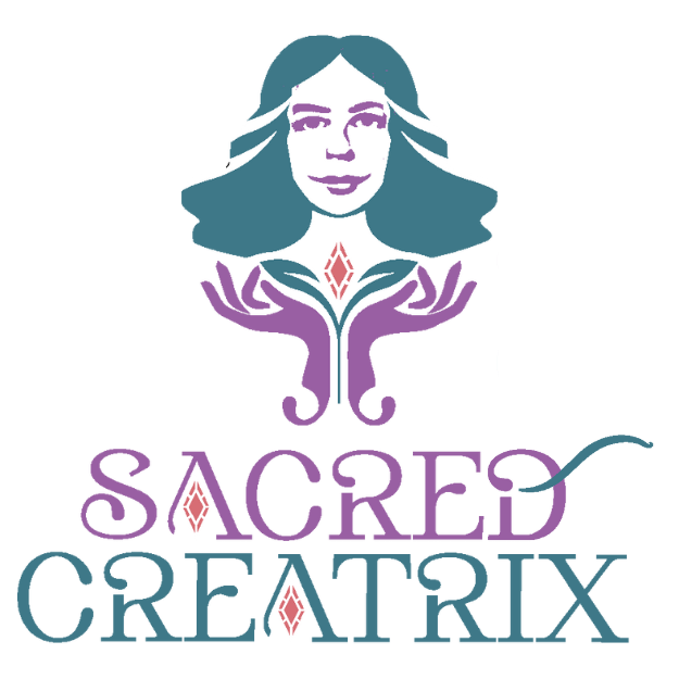
To create a brand that truly represented Sacred Creatrix, I started with a logo redesign. The new logo was inspired by Krystal’s face, incorporating two hands symbolizing growth, holding a plant and a crystal, alluding to Krystal’s name. This logo embodied the nurturing and transformative nature of the program, illustrating the growth and healing that participants would experience.
The color palette was carefully selected to reflect the place where Krystal feels most spiritually connected—the beach. I chose shades of teal, purple, and coral, reminiscent of a sunset near the ocean. These colors evoke a sense of calm, spiritual depth, and connection to nature, aligning perfectly with the program’s ethos.


EXTENDING
THE BRAND’S PRESENCE
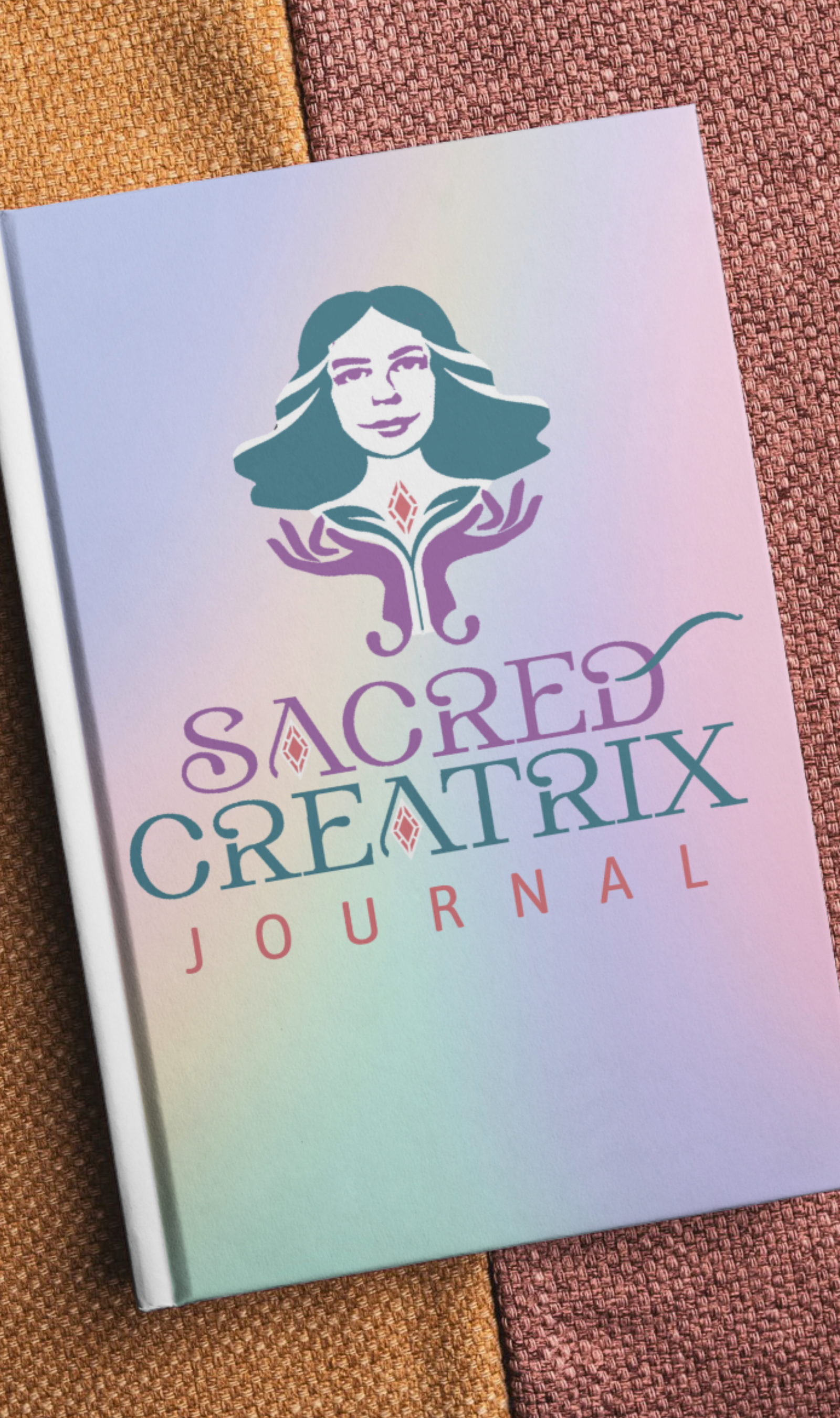
In addition to the logo, I created a suite of branding assets, including alternative logos and visual representations of the brand on mugs, tote bags, and journals. These items are not just merchandise; they are tools that participants can use daily, reminding them of their journey and the community they are a part of.
BRANDED
AI PORTRAITS
To further enhance the brand’s identity, I developed an AI portrait series that portrayed Krystal as an ethereal goddess of the ocean- mermaid- ethereal moon flower goddess. These portraits not only highlight Krystal’s spiritual essence but also resonate with the mystical and transformative journey that Sacred Creatrix offers its participants.
RESULTS
OF THE PROJECT
The new branding for Sacred Creatrix has been well-received, creating a strong, cohesive identity that resonates deeply with its target audience. The logo, color palette, and visual assets have successfully captured the program’s essence, creating a brand that is not only visually appealing but also spiritually aligned with its mission. Krystal now has a brand that reflects her passion, her spiritual connection, and the transformative power of the Sacred Creatrix program, helping her to attract and connect with the right clients.
This case study highlights the power of thoughtful, spiritually aligned branding and how it can create a deep connection with the audience, making the Sacred Creatrix program not just another business course, but a transformative journey for new entrepreneurs.


